
Wednesday, November 19, 2008
Falling Back
From 1950 to 1999 the infant mortality rate declined from 23 to 7.1 deaths per 1,000 live births. Much of this decline was realized between 1950 and 1985, but there continued to be a modest decline throughout the 1990s. Unfortunately, since 2000 the infant mortality rate in the United States has been stable, while it has continued to improve elsewhere. Thus the United State’s dropped from 23rd in 2000 to 29th in 2007. Now the United States is tied with Poland and Slovakia and ranks just above Puerto Rico.

Thursday, October 23, 2008
Infant Mortality -- Strangely High in the USA
A recent report from the National Center for Health Statistics reports that the infant mortality rate in the United States is 6.9 infant deaths per 1,000 births. This is surprisingly high given the level of economic development in the United States in 2004. Indeed, "the United States’ international ranking fell from 12th in 1960 to 23d in 1990, and to 29th in 2004."
The United States is 29th? That seems low, doesn't it?

The United States is 29th? That seems low, doesn't it?
Wednesday, July 2, 2008
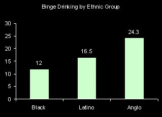
Who Binge Drinks?
Binge drinking is often defined as having 5 or more drinks in a day. According to the National Center for Health statistics the proportion of people who binge drank at least once in the last year was 20.7%. Men are more than two times more likely to have binged and young adults are more likely than older folks. There are also fairly large race-ethnic differences. Anglos (i.e. Non-Hispanic whites) are twice as likely as African Americans to have binge drank in the last year.

Monday, June 30, 2008
How much of income is spent on housing?
Common wisdom says that one should spend no more than 30 percent of the family income on housing. The American Community Survey provides information on housing costs as a percentage of income by age. It's clear from these numbers, presented in a graph below, that in 2006 many people were spending over 35% of their income on housing, particularly those in young adulthood and households headed by a retiree.

Friday, June 27, 2008
Increasing health care costs
Over the past 10 years the percentage of people who did not seek medical care because of costs has been rising, according to a recently released report by the CDC. This increase can not be explained because of aging, because the graph below is "age adjusted" and still shows this trend. There are a couple of other possible explanations, however. It might be that the percentage of people without insurance is increasing. Although this graph from the report suggests that the percentage of people without health insurance has been roughly flat over this period, the proportion insured among those age 18-64 has been declining (while the proportion of children insured has been increasing). Another possible explanation could be that health care costs have risen, or that other cost (like food and gas?) are on the rise, squeezing the family budget.
It also could be that we are just clumsier today than we were 10 years ago.
It also could be that we are just clumsier today than we were 10 years ago.
Thursday, June 26, 2008
Got Art?
In 2006 the General Social Survey asked respondents whether they saw themselves as having few artistic interests. The graph below presents their responses. We can see fluctuations by age. Generally, young adults often have artistic interests, and this sharply declines in what one might refer to as the early career stage (age 25-44). After this stage, the proportion saying that they don’t have artistic interests declines up until retirement. After retirement, the artistic folks seem to suddenly decrease.
This led me to wonder whether artistic people are more likely to die young. Or have there been cohort changes in artistic interests so that (for example) those born during the depression (age roughly 66-76 in 2006) were less interested in art? The fact that the proportion with artistic interests increases after age 75 makes me think this might be a cohort phenomenon.
This led me to wonder whether artistic people are more likely to die young. Or have there been cohort changes in artistic interests so that (for example) those born during the depression (age roughly 66-76 in 2006) were less interested in art? The fact that the proportion with artistic interests increases after age 75 makes me think this might be a cohort phenomenon.

My interpretation might also be swayed by the fact that I have artistic interests.
Wednesday, June 25, 2008
Which states are the “healthiest”?
The answer probably depends to some extent on what you use as a measure of health, but death rates seem like a pretty good indicator. According to the most recent death statistics released by the National Center for Health Statistics, the states with the lowest age-adjusted death rates are Hawaii, Minnesota, California, and New York (from low to not quite as low). The states with the highest age-adjusted death rates are Mississippi, Alabama, West Virginia, Louisiana, and Oklahoma (from extremely high to not quite as high). I guess it is either very good or very bad to live on a coast. I'd wonder if the Gulf of Mexico were toxic, except that Florida falls right after New York in the list of low death rate states.
Probably more relevant, a characteristic that all the states with the high mortality rates share is relatively low levels of education.
Perhaps it is some consolation to Oklahoma that they currently have unusually low unemployment rates?
Probably more relevant, a characteristic that all the states with the high mortality rates share is relatively low levels of education.
Perhaps it is some consolation to Oklahoma that they currently have unusually low unemployment rates?
Tuesday, June 24, 2008
Plenty of work?
One curious inconsistency noted by yesterday’s comment, is the fact that there are many jobs that go unfilled. How can the unemployment rate increase while jobs are available? One answer to this question is that it takes some time to someone to respond to an advertisement and be hired. Another, even more important factor, is that there is a mismatch between the characteristics of the unemployed and the characteristics of the jobs available. The unemployment rate is much, much higher for teens and for those with lower levels of education (see graph below). Another form of mismatch is between the location of the employer and the location of the employee. This is especially important now that gas prices are so high and commuting costs are higher. If the salary doesn’t cover the costs of being employed, an potential worker can not afford to take the job.

Monday, June 23, 2008
May Unemployment by State
On Friday the Bureau of Labor Statistics released May 2008 unemployment statistics by states. About a month ago, I posted the April figures. In April, California, Michigan, Rhode Island, Alaska, and Washington D.C. had the highest levels of unemployment. Between April and May, Rhode Island experienced the highest gains in unemployment and now sits with a 7.2% unemployment rate, and Alaska had the second-highest unemployment rate at 7.0%. In contrast, Oklahoma continued to enjoy declines in unemployment and now has a 3.5% unemployment rate, down from 4.5% in April.


Friday, June 20, 2008
Families with children
How many parents do children typically live with? Today, it is still the case that most children (almost 60%) are in families with two parents.


Of course, some of these families have a mother who is married to someone other than the biological father of their children. In this case, the family would be a married couple family, according to the census bureau definitions. It's still relatively rare for children to live with unmarried fathers, but it's only about half the percentage living with lone mothers (12 versus 22 percent). The difference is (as explained here) that many of the lone fathers are cohabiting with the child's mother.
Thursday, June 19, 2008
Where do you get your news?
The 2006 General Social Survey asked respondents “Where do you get your news?” Their responses indicate that television continues to play an important role, with just about half stating that it is their primary source. Coming in second were newspapers, magazines and books, with newspapers dominating this category. The internet was the third most common response, with 14% getting their news mostly from the internet (like me).
Favored media vary considerably by level of education. Television is preferred by everyone, but much more so at lower education levels. As education increases use of written sources and the internet increases.
Favored media vary considerably by level of education. Television is preferred by everyone, but much more so at lower education levels. As education increases use of written sources and the internet increases.

Wednesday, June 18, 2008
Fewer die of the flu
In an earlier post I listed the 15 leading causes of death in 2005. A recent report by NCHS updates this list from 2006 death rates. According to these most-recent death statistics, Alzheimers passed diabetes to become the sixth leading cause of death. This was because the death rate for Alzheimers dropped by only 0.9%, while the death rate for diabetes dropped by 5.3%. The largest drop in the death rate was for Influenza and Pnemonia, 12.8. I guess either folks got their flu shots in 2006 or the flu was not especially virulent that year.
Tuesday, June 17, 2008
High School Graduation Rates
The National Center for Education Statistics reports trends in the high school graduate rate since 1969. This is calculated as the percentage of students who start high school that have received their regular diploma (i.e. not a GED) 4 years later. The estimates for most recent years (the yellow part of the graph below) are projections, since those who started high school in 2005 haven’t had 4 years to complete their degree. The first thing that strikes me is the overall flatness of the line. Overall, levels of education are increasing and those not achieving a high school diploma are excluded from many jobs. GEDs can make up some of the difference, but previous research suggests that the employment characteristics of those with GEDs are more similar to those with no certification than those with a regular diploma. That high school graduation rates went up from the late 1990s to 2005 is promising, but recent declines lead me to question whether these improvements can be maintained.

Importantly, until recently the federal government reported graduation rates above 80%, but some claim that the actual rate is under 70%. One issue was that accountability systems have schools and districts calculating rates at the local level. This raises a problem when struggling students leave one school to attend another. The original school does not consider him a drop out, but the new school wouldn’t have this student included as a member of the freshman class. Another is the tendency to remove students who receive GEDs from the statistical system or to count them as graduates. As stated above GEDs are not equivalent to high school diplomas. A third issue is raised by special education students. Ambiguities allow officials to manipulate the numbers to present their schools and districts in the most positive light.
Given the importance of earning a high school diploma and the unremarkable record of the United States educational system in bringing students up to this minimal standard of competency, it is important for us to invest in the federal educational data system.
Monday, June 16, 2008
And still a long way to go, baby
Although occupational segregation by gender has declined in recent years, a persistent area where women continue to be under-represented is in Science, Technology, Engineering, and Math (STEM) occupations. Women make up 46 percent of the labor force and 56 percent of all professional occupations, but only 30 percent of “computer and mathematical” occupations and 13 percent of “architecture and engineering” occupations. In contrast, women make up 80% of health technologists and technicians and 75 % of workers in office and administrative support occupations (2000 Census).
Friday, June 13, 2008
Increasing Diversity
The American Community Survey, conducted by the Census Bureau, provides yearly updates on the population characteristics of the U.S. In an earlier post I described the race-ethnic diversity of the U.S. population as of 2006. Now, 2007 estimates are available. Between 2006 and 2007 the overall population grew by 0.74%, but of course some groups grew faster than others. For example the non-Hispanic white population grew by only 0.17%, but the Hispanic population grew by 2.67 %


Thursday, June 12, 2008
Living Longer
Back in April, I posted a graph of trends in life expectancy, which shows that white women have the longest life expectancy, but other groups are catching up. Yesterday the National Center for Health Statistics released mortality data for 2006. Death rates declined and life expectancy is at an all-time high, 78.1 years. Life expectancy increased the most for black men, from 69.5 in 2005 to 70.0 in 2006. Even so, African American men still have the lowest life expectancy at birth.

Wednesday, June 11, 2008
Smokin'
The National Center for Health Statistics periodically produces accounts of the nation’s health. In these reports there’s a lot of information on things ranging from joint pain to psychological distress. Here we can find trends in the percentage of people age 25 and over who are current smokers by education. The good (and not very surprising) news is that smoking has declined. Also, only 8 percent of people with a Bachelor’s degree smoke. Less promising is the fact that smoking is more prevalent among the less educated and the declines in smoking over the last 20 years have been less steep. 

Tuesday, June 10, 2008
Graduation Rates
A report released last week by the National Center for Education Statistics describes graduation rates for the cohort that entered Title IV institutions in 2000. On average only 36 percent of those starting college in 2000 had received their Bachelor’s degree after 4 years. This increased to 53 after 5 years. Private not-for-profit schools have better graduation rates than public institutions or for-profit schools. Perhaps this is because private schools are more selective? It seems to me more likely that students get through more quickly because tuition is a lot higher and also because these schools typically provide better services to students. 

Monday, June 9, 2008
Teens and Immigrants especially hard hit by weak economy
On Friday June 6th, the Bureau of Labor Statistics released the May 2008 unemployment figures. Headlines noted the results as evidence of the weak economy, the stock market tanked (probably more on oil prices than unemployment figures), and many noted that the .5% increase in the unemployment rate was the greatest increase since 1986.
Of course, economic downturns are not felt equally across the economic (or demographic) spectrum. The BLS press release clearly indicates that those age 16-19 experienced the greatest increase in (seasonally adjusted) unemployment from April (15.4) to May (18.7). Yes, that’s right, teenagers experienced a whopping 3.3% point increase in unemployment in May.
Now, teens aren’t a large proportion of the labor force and adult men and women also experienced increases in unemployment, although these increases where much smaller (.3% and .5% respectively).
If you have a teen who is frustrated with their attempts to find a summer job, cut him/her a break! The graph below depicts the (seasonally adjusted) May unemployment rates from 1998 to the present. Clearly the last two years have NOT been good.

Thursday, June 5, 2008
Adolescent Health
A report on adolescent health published by the National Center for Health Statistics presents interesting facts about adolescent risk-taking. One positive trend has been a decline in the proportion of teens that ride in a car as a passenger without using a seatbelt. Only 10 % say that rarely or never wore a seatbelt. Somewhat more disappointing is the proportion that says that they rode with a driver who had been drinking (28.5%).
That’s probably because drinking is fairly common among teens old enough to drive a car. Over 30 percent of 16-17 year old teens have had a drink in the last 30 days and this percentage goes up to 50 percent among those age 18-19. My guess is that these kids aren't drinking at home.

That’s probably because drinking is fairly common among teens old enough to drive a car. Over 30 percent of 16-17 year old teens have had a drink in the last 30 days and this percentage goes up to 50 percent among those age 18-19. My guess is that these kids aren't drinking at home.

Wednesday, June 4, 2008
Primary Reivew
In reference to the 2008 presidential elections, the word "historic" has been thrown around a lot in the last couple of days, for good reason. This primary season has been a remarkable show of democracy at its most difficult and at its best. One of the most positive aspects has been the unusually large turn out at the primary elections. The table below depicts the total number of votes cast in the primary elections, the proportion of those votes that were cast for a democratic candidates, the numer of people in each state according to the 2006 American Community Survey and the proportion of the population that voted. Of course, not everyone in a state is eligible to vote. So, voting rates are in a sense artificially deflated.

If anyone has a good solution for posting tables, I'd be more than happy to hear it.

If anyone has a good solution for posting tables, I'd be more than happy to hear it.
Social Security
One potentially worrisome consequence of our population aging is the viability of our social security system. Generally speaking the majority of the United States population is concerned that we are spending too little on social security. This percentage has been growing from about 50 percent in the early 1990s to 64 percent in 2006, the time of the last General Social Survey. At the end of the Clinton administration, when we were running a budget surplus, social security was actually in pretty good shape and only minor adjustments were necessary to weather the years supporting the baby boom generation. With the heavy spending of the Bush administration, our options for maintaining solvency for this important social program are now more limited.
Yet I don’t think the proportion of the population that’s concerned about social security has so much to do with whether the program is in trouble as the proportion of the population that’s nearing retirement.

Question wording: We are faced with many problems in this country, none of which can be solved easily or inexpensively. I'm going to name some of these problems, and for each one I'd like you to tell me whether you think we're spending too much money on it, too little money, or about the right amount.
Tuesday, June 3, 2008
Internet Advantage
Those of us who spend endless hours on the intenet might find it hard to imagine that some people spend little-to-no time online. In 2006 there was a distinct educational gradient with the mean number of hours spent online per week for those with a college degree more than  double than the number of hours spent online for those with less than a high school degree. In fact, nearly 3 out of 4 people with less than a high school degree spent zero hours on the internet.
 double than the number of hours spent online for those with less than a high school degree. In fact, nearly 3 out of 4 people with less than a high school degree spent zero hours on the internet.
 Maybe the disparity arises because educated folks are more likely to have jobs with internet access or maybe it's because college life encourages internet use. It seems likely that there are also differences in internet access at home, but according to the Pew Internet & American Life project the so-called digital divide is closing somewhat in recent years.
Monday, June 2, 2008
Unemployment
In a previous post, I reported that the large metropolitan areas with the lowest levels of unemployment in March were New Orleans, Washington D.C., Oklahoma City, Austin, Birmingham, and Phoenix. In April, the order of these 6 cities changed, but they are still the top six. Oklahoma City was the city with the lowest unemployment rate (2.9). Overall, however, the unemployment situation is less than ideal. Of 369 metropolitan areas in the United States, the unemployment rate was higher than a year ago in 261. These unemployment figures, combined with high gas prices, and dropping housing values, may help to explain why consumer confidence is at a 16 year low.
Perhaps nowhere (in the metropolitan United States) has experienced a worse year than Detroit. Detroit had the highest unemployment rate in April, but things look a little bit better than March when the unemployment rate was 7.7. In April Detroit’s unemployment rate dropped to 6.9 percent. Even so, it’s tough times for auto workers.
Maybe Detroit will be consoled tomorrow if the Red Wings win the Stanley Cup.
Friday, May 30, 2008
Maternal employment
Today, most mothers are employed, and the majority of employed mothers are working full time. This is especially true of mothers of older children, but even among mothers of infants, half (51.9%) are employed and by far most of these mothers are e mployed full-time.
Trends in maternal employment spark intense controversy between those who argue that women should work, either for greater self-fulfillment or because it is very difficult for most families to make ends meet without the mom working. Others, take offense at the notion that caring for children is not noble or worthy, sometimes demeaning mothers who do decide to take one paid employment. I can understand this perspective, since we often devalue care work.
A consequence of this controversy is that we often scrutinize trends to find evidence that women are starting to forgo career for family (or vice versa). Either out of economic necessity or philosophical differences, diversity is here to stay.
 mployed full-time.
These high levels of maternal employment reflect a substantial social change since the 1960s and 70s. Yet, maternal employment has not grown substantially since the late 1990s, despite the passing of legislation (e.g. the Family Medical Leave Act, 1993) that should have improved women’s ability to combine paid work with child rearing.
Trends in maternal employment spark intense controversy between those who argue that women should work, either for greater self-fulfillment or because it is very difficult for most families to make ends meet without the mom working. Others, take offense at the notion that caring for children is not noble or worthy, sometimes demeaning mothers who do decide to take one paid employment. I can understand this perspective, since we often devalue care work.
A consequence of this controversy is that we often scrutinize trends to find evidence that women are starting to forgo career for family (or vice versa). Either out of economic necessity or philosophical differences, diversity is here to stay.
Thursday, May 29, 2008
Aging Population
The population of the United States is aging remarkably slowly. Today 12.4 percent is over age 65 and this actually represents a decrease from 12.6 percent in 1990. In contrast, Japan is experiencing a fairly rapid aging of its population. In 2000, 17.3 percent of the population was age 65+, up from 12.0 percent 10 years earlier. We can expect that the United States will age a little bit faster as the baby boomers (born 1945-1964) reach their golden years, but nothing like Japan.
Wednesday, May 28, 2008
Demographic data
According to a recent report by the National Center for Health Statistics, almost 1 out of 6 United States residents lives in a household without a landline. This has important implications for the way basic demographic data are collected, particularly for young adults (age 18-24). In an attempt to maintain data quality, some survey organizations are starting to add cell phone numbers to their call lists.
Not including cell-phone only households is not a problem if these households are similar to households with landlines, but this same study found for instance that binge drinking (having 5 or more drinks in an episode) was twice as common among the cell-phone only households.
Click on this picture to actually see it:
Tuesday, May 27, 2008
Variation in Education
The American Community Survey is a good source of up-to-date information on population characteristics. For example, they have state ranking tables that show facts such as median age, the sex ratio, or percentage of the population with a bachelor’s degree. Washington D.C. has an exceptionally high proportion of the population with a bachelor’s degree. It also has the highest rate of child poverty. That is, Washington D.C. has an exceptionally high level of inequality, but this is not really a fair comparison and we would likely find similarly high levels of inequality in New York city or many other large urban areas.
"States" ranked by percentage of Population with a Bachelor's Degree
West Virginia 17
Arkansas 18
Mississippi 19
Kentucky 20
Louisiana 20
Nevada 21
Alabama 21
Indiana 22
Tennessee 22
Oklahoma 22
South Carolina 23
Wyoming 23
Ohio 23
Idaho 23
Iowa 24
Missouri 24
Michigan 25
Texas 25
North Carolina 25
South Dakota 25
Wisconsin 25
Florida 25
New Mexico 25
Pennsylvania 25
Arizona 26
North Dakota 26
Maine 26
Georgia 27
Alaska 27
Nebraska 27
Delaware 27
Montana 27
Oregon 28
Kansas 29
Utah 29
Illinois 29
California 29
Rhode Island 30
Hawaii 30
Minnesota 30
Washington 31
New York 31
New Hampshire 32
Vermont 32
Virginia 33
New Jersey 33
Connecticut 34
Colorado 34
Maryland 35
Massachusetts 37
Wash. D.C. 46
Monday, May 26, 2008
Remembering Veterans
Memorial day is an opportunity to remember those who have died in the military service. By the most recent count I can find, 4,081 men and women in military service have died in Iraq and 432 have died in military service in the Afghanistan area since 2001. Knowing how difficult it is to lose these lives helps put into perspective the 11,260,000 men and women who died in military service to the United States in World War II and the 58,209 who died in Vietnam.

Generally speaking more recent generations have borne a much lighter military burden than older generations. According to the 2006 American Community Survey about 20% of the male population in the United States has served some time on active duty in the U.S. Army, Navy, Air Force, Marine Corps, or the Coast Guard.* This proportion is much lower for younger generations than those who were old enough to fight in WW II.
* The full definition of veteran that the Census bureau uses is as follows: a person 18 years old or over who has served (even for a short time), but is not now serving, on active duty in the U.S. Army, Navy, Air Force, Marine Corps, or the Coast Guard, or who served in the U.S. Merchant Marine during World War II. People who served in the National Guard or military Reserves are classified as veterans only if they were ever called or ordered to active duty, not counting the 4-6 months for initial training or yearly summer camps.

Generally speaking more recent generations have borne a much lighter military burden than older generations. According to the 2006 American Community Survey about 20% of the male population in the United States has served some time on active duty in the U.S. Army, Navy, Air Force, Marine Corps, or the Coast Guard.* This proportion is much lower for younger generations than those who were old enough to fight in WW II.
These generational differences will likely shape the debates between Obama and McCain this summer. McCain, who will turn 73 this August, is of a generation where the majority of men served in the military. Obama is 46 and of a generation where military service was much less common.
* The full definition of veteran that the Census bureau uses is as follows: a person 18 years old or over who has served (even for a short time), but is not now serving, on active duty in the U.S. Army, Navy, Air Force, Marine Corps, or the Coast Guard, or who served in the U.S. Merchant Marine during World War II. People who served in the National Guard or military Reserves are classified as veterans only if they were ever called or ordered to active duty, not counting the 4-6 months for initial training or yearly summer camps.
Friday, May 23, 2008
Marriage again
Last Friday I showed a graph depicting the increasing age at marriage. The interesting aspect of this trend is that it means that we are delaying an event that nearly everyone looks forward to. Typically we like to “eat dessert first” so to speak, so this is a bit of a departure from the norm. For a minority of folks, gays outside of Massachusetts and California, perhaps legal constraints account for the delay, but for most this isn’t a good explanation.
Up to a point, delayed marriage is wise. Waiting until age 21 substantially decreases the chances of divorce.After age 21, delays don't do much to reduce the risk of divorce, but the median age at marriage is over 27 for men and over 25 for women. So, why wait 4-6 years after age 21?
Could it be that we actually value something else more than marriage? Or is it just that we’d like to marry, but the right person hasn’t appeared….yet.
Thursday, May 22, 2008
Unconsidered Patriot
What is patriotism? Is it wearing a lapel pin? Is it supporting our troops? Could it be speaking out against war? In 2004 the General Social Survey asked a sample of United States residents whether people should support their country even if the country is in the wrong. Approximately the same proportion agreed or strongly agreed with this statement (37%) as disagreed or strongly  disagreed (40%). The propotion responding affirmatively for those with less than a high school diploma is considerably higher (46%) than for those with a college degree (29%).
It seems that even elementary education teaches that patriotism (in the United States) is about the ideals of democracy and not simply about proudly waving the flag. Why isn't there more widespread disagreement with this statement across all education groups?
 disagreed (40%). The propotion responding affirmatively for those with less than a high school diploma is considerably higher (46%) than for those with a college degree (29%).
It seems that even elementary education teaches that patriotism (in the United States) is about the ideals of democracy and not simply about proudly waving the flag. Why isn't there more widespread disagreement with this statement across all education groups?
Wednesday, May 21, 2008
Diet and Nutrition
A recent report released by the National Center for Health statistics describes the dietary habits of those age 60 and older. The report provides information on overall quality of diets as well as specific aspects. Dietary guidelines suggest that  the typical woman should have 6 servings of grains, 3 servings of vegetables, 2 servings of fruit, 2-3* servings of dairy, and 2 servings of protein daily.
 the typical woman should have 6 servings of grains, 3 servings of vegetables, 2 servings of fruit, 2-3* servings of dairy, and 2 servings of protein daily.
*The number of servings depends on your age. Older children and teenagers (ages 9 to 18 years) and adults over the age of 50 need 3 servings daily. Others need 2 servings daily. During pregnancy and lactation, the recommended number of milk group servings is the same as for nonpregnant women.
Overall, the NCHS report indicates that fewer than one in three elderly Americans get sufficient amounts of the 5 food groups and only 17% have a "good" quality diet. The graph below presents some of the details by food group for women. The height of each bar indicates the score for each food group by education. If 100% of women ate sufficient amounts of meat daily, the height of the bar would be 10. The lightest bars are for those with less than a high school degree; the medium green bars are for those with a high school degree but no college and the darkest bars are for those with at least some college. 
Deficiencies are greatest for fruits, especially for those with less than a high school degree. The patterns for men look very similar (not shown), except that dairy is tied with fruit for the highest deficiency.
Importantly, eating more often does not lead to a better quality diet. The obese have the greatest deficiency of dairy and fruits.
I guess the good news out of the report is that 72% of elderly adults consume no more than the recommended amount of cholesterol.
Tuesday, May 20, 2008
Kentucky and Oregon
My predictions for West Virginia underestimated by a considerable margin the amount of the vote Clinton would win and I didn’t do nearly as well as some other prognosticators. A variety of factors that I didn’t consider in my estimates worked in her favor. First, West Virginia has a less educated population than any of the states with recent primaries. Obama does better with the college educated crowd than does Clinton. I really don’t think this is the direct reason why my estimates were off, however. I think that the real reason was that West Virginia’s population is older than most other states. Older folks tend to have less education, turn out in large numbers at the polls, and vote for Clinton.
Kentucky’s population more closely resembles that of Ohio or Indiana in terms of age and it falls somewhere between Indiana and West Virginia in terms of the educational attainment of whites age 25+. This leads me to expect that Clinton will not do quite as well in Kentucky as she did in West Virginia. All in all I expect her to get about 56% of the vote in that state – a solid win, but not as much as what is currently projected by polling data and not enough to change the outcome of the nominations process.
Figuring out Oregon is much more difficult. There haven’t been many recent primaries in the West, few of these primaries were accompanied by exit polls, and clearly the West votes differently than Appalachia. In short, I lack any useful data. It seems like recent polls indicate that Obama will win 50-55 percent of the vote. I don’t think it will be that close. Obama won 61 % of Wyoming, 68 % of Nebraska and Washington State, 66% of Minnesota and 80 % of Idaho. He did lose in neighboring California, obtaining only 41% of the vote there, but county maps suggest he did better in the northern part of that state. My rough guestimate is that Obama will win at least 64% of the vote in Oregon.
Monday, May 19, 2008
Unemployment

The Bureau of Labor statistics posted this nifty map showing unemployment rates for states on Friday. California, Michigan, Rhode Island, Alaska, and Washington D.C. currently have the highest levels of unemployment. In addition, Florida, Nevada, and Georgia have experienced a percentage point gain in unemployment over the past year.
It's important to note that unemployment has a very narrow definition. To be unemployed a person has to not have been employed in the last week and to have actively looked for work in the last 4 weeks. If we add in people who are discouraged workers (that is, people who want work but haven’t looked because they don’t think jobs are available) and other people who aren’t working as much as they would like, the proportions are somewhat higher.
Meanwhile, Oklahoma has experienced a percentage point drop in unemployment over the past year. I guess it is not much surprise that the nation's breadbasket, as well as many of the oil-producing states, are doing pretty well these days.
Friday, May 16, 2008
Marriage
A social trend that provokes nearly no one is the increased median age at marriage. Trends in the percent married by the end of their 25th year show remarkable declines in marriage in early adulthood. Fewer and fewer young adults marry in their early twenties. Almost everyone says that they would like to marry someday and most also say that they would be better off if they were married. Yet, most are content to put this off until some time later.
If marriage is such a good thing, why put it off?

If marriage is such a good thing, why put it off?
Thursday, May 15, 2008
Happy?
Today's entry demonstrates that the more things change, the more they stay the same. You'd think that, given dramatic changes in the cost of of a gallon of gas, the political party in power, levels of unemployment, racial unrest, divorce, or whatever over the past 26 years there would have been wild fluctuations in levels of happiness. Nope.

Maybe if I choose a different scale for the graph....nope. I have to think that 1984 wasn't a good year, but otherwise things are pretty stable.

Maybe if I choose a different scale for the graph....nope. I have to think that 1984 wasn't a good year, but otherwise things are pretty stable.
Wednesday, May 14, 2008
Sleep
A recent report published by the National Center of Health Statistics examines sleep patterns in the 
Of course, it’s hard to say that sleeping too little or too much makes you obese. It might be that being obese makes it harder to sleep. Or it could be that other health conditions both interfere with sleep and exercise. Nonetheless, other research suggests that people who don’t get enough sleep eat more during the day.
Bottom line: A growing number of studies suggest that getting enough sleep is an important part of maintaining good health.
Tuesday, May 13, 2008
West Virginia Primary
I did farily well predicting the North Carolina and Indiana primaries just using exit poll and census data, especially if you ignore my delegate calculations. (Doh!) Let's see how dumb my luck was...

I worked under the assumption that voting tendencies by race and gender would hold steady. And the table above shows that they did. If anything, Clinton grabbed a larger share of the white vote than expected. This was offset by the fact that the voting rates for whites were much lower than for blacks. Obama is clearly drawing many new minority voters to the polls.
West Virginia has an exceptionally large proportion of its white population that never went to college. We can expect these voters to like Clinton over Obama, but lets see if they actually go to the polls now that Clinton's chances of receiving the nomination appear severely dented.
Bottom line: Keeping with what so far as worked pretty well, I predict that Clinton will win West Virginia with 58% of the vote. Currently polls suggest an even larger win. Let's see who's right.
Monday, May 12, 2008
College Squeeze
It seems that the college admissions game continues to get more crazed every year. This is true not only among elite schools, but also public universities. Two issues make getting into a top college much more difficult in recent years. The first is the remarkable growth in postsecondary schooling. Nowadays, most high school graduates continue their educations after receiving their diplomas. Another factor has to do with the number of babies born approximately 18 years ago.
Between 1985 and 1990 the number of babies born in the United States increased from 3.67 million to 4 million. That meant that those applying for college this year were competing with a lot more people than those applying just five years ago. The situation will be even worse next year, but should start to get better in 2010.
Those of you with 7 year olds might start working on buffing up those GPAs and test scores ASAP.
Tomorrow...West Virginia predictions.
 years ago.
Between 1985 and 1990 the number of babies born in the United States increased from 3.67 million to 4 million. That meant that those applying for college this year were competing with a lot more people than those applying just five years ago. The situation will be even worse next year, but should start to get better in 2010.
Those of you with 7 year olds might start working on buffing up those GPAs and test scores ASAP.
Tomorrow...West Virginia predictions.
Friday, May 9, 2008
Family Life
An interesting trend in family life, one that almost everyone knows about, is the growth in single parent families. So, it isn't much surprise to anyone that many households (60 percent in 2006) with a female householder contain children. It might be slightly more surprising to know that almost half of households with an unmarried male householder have children. Some might see this as evidence for a sudden increase in men taking custody of children in the event of divorce. It is not. No, this is because of an increase in unmarried couples living together with children, sometimes their own children, sometimes children from a previous relationship.

What I find surprising in the above graph is that the household type that is least likely to have children is a married couple hou sehold. You might think then that most children are raise in single parent families. This would be wrong...By far, most children live in married couple households. This is possible because most households, with children or not, are maintained by a married couple.

What I find surprising in the above graph is that the household type that is least likely to have children is a married couple hou
 sehold. You might think then that most children are raise in single parent families. This would be wrong...By far, most children live in married couple households. This is possible because most households, with children or not, are maintained by a married couple.
Thursday, May 8, 2008
Trends in Religious Fundamentalism
Reading various online sources, I see that many have impressions about whether religious fundamentalism or religious liberalism is increasing or on the decline. The General Social Survey, conducted by the University of Chicago’s National Opinion Research Center, has asked a representative sample of United States residents about their religious beliefs in every interview since 1972. In the early 1970s most responded that they had moderate beliefs and less than 20 percent claimed to hold liberal beliefs. From the early 1970s through the mid 1980s religious fundamentalism (or at least the proportion claiming to be fundamentalist) was on the rise and there was a substantial decline in moderates. Since that time, the proportion claiming to be liberal is increasing.

I'm not sure whether these trends actually represent real declines in the proportion holding fundamentalist beliefs (e.g. that the bible is the literal word of the creator) or if it reflects growing distaste for the "fundamentalist" label as it is now associated with religious extremism and intolerance. It's hardly scientific evidence, but I found identifying a blog that has a positive spin on "religious fundamentalism" to be difficult, while finding one that is religiously conservative is easy. I think the increase in the proportion reporting that they are liberal (despite the fact that this term is not especially popular) reflects real changes in beliefs.

I'm not sure whether these trends actually represent real declines in the proportion holding fundamentalist beliefs (e.g. that the bible is the literal word of the creator) or if it reflects growing distaste for the "fundamentalist" label as it is now associated with religious extremism and intolerance. It's hardly scientific evidence, but I found identifying a blog that has a positive spin on "religious fundamentalism" to be difficult, while finding one that is religiously conservative is easy. I think the increase in the proportion reporting that they are liberal (despite the fact that this term is not especially popular) reflects real changes in beliefs.
Wednesday, May 7, 2008
Demography of Aging and Health
Given the aging of the United States (and for that matter, the world) population, health is a growing industry. As explained by UnderstandingSociety there is a similarity between sociology (the home discipline of demography) and epidemiology. One place where these two disciplines actually intersect is in the study of social influences on health and disease. A persistent finding in the health literature is that education has a strong influence on health and mortality. Age-adjusted death rates for both men and women age 25-64 are much lower for those with higher levels of education, as illustrated by these results published in a report by the National Centers for Disease Statistics.


These differences can not be explained by differences in income and is observed across many different countries.
Tuesday, May 6, 2008
Unemployment Trends
According to a report released last week by the Bureau of Labor Statistics the unemployment rate in April was 5.0%, up from 4.5 a year ago, but little changed from last month’s rate of 5.1%. Generally these findings were better news than what was expected, but it’s still the case that employment in construction, manufacturing, and retail trade decreased. This is a very short-term view of labor force change, which might be helpful in determining how long and deep our current recession will be, but monthly shifts can also be over-interpreted.

Taking a longer-term view, we can clearly see that among those age 25 and older, unemployment rates are much higher for those with less education. April 2006 to April 2008 unemployment rates grew 13% for those with less than a high school degree, but actually declined slightly (4.5%) for those with a Bachelor’s degree. Of course, you get different trends if you compare across different time periods, yet a consistency across time is that unemployment rates are less volatile for the more educated.
Tune back tomorrow for a post on Health and Aging.
Monday, May 5, 2008
Primary Trends
Many believe that Rev. Wright’s sermons (as they were presented in the media) did substantial damage to Barack Obama’s advantage in North Carolina. Recent polling data supports this interpretation, but polls don’t present a consistent picture and they aren’t the only source of information we have available to analyze this issue. In addition, we have information on the demographic make-up of Indiana and North Carolina. We also have exit poll data.
Exit poll data show that an increasing proportion of white men and women are voting for Clinton, while Clinton’s share of the black vote is declining. Note that Rev. Wright’s sermons were broadcast around March 10 and Obama’s speech on race (responding to the Wright furor) occurred about a week later, March 18. The Ohio Primary was March 4 and Pennsylvania’s was April 22. Judging just from the trend from Ohio to Pennsylvania, it looks like Obama handled the situation well enough not to lose votes to Clinton, at least not during March and April.
Another way of putting this is, if Pennsylvania had the same demographic profile as Maryland, he would have won over 60 percent of the vote there. Based just on the race and gender distributions of Indiana and North Carolina’s populations, as well as voting rates and voting patterns by race and gender, I predict that Obama will win 56% of the vote in North Carolina and Clinton will win 52% of the vote in Indiana. Or, put another way, Obama will collect 114 delegates to Clinton’s 104 (calculations are available on request).
Tomorrow's post will be about unemployment trends.
Exit poll data show that an increasing proportion of white
 men and women are voting for Clinton, while Clinton’s share of the black vote is declining. Note that Rev. Wright’s sermons were broadcast around March 10 and Obama’s speech on race (responding to the Wright furor) occurred about a week later, March 18. The Ohio Primary was March 4 and Pennsylvania’s was April 22. Judging just from the trend from Ohio to Pennsylvania, it looks like Obama handled the situation well enough not to lose votes to Clinton, at least not during March and April.
Another way of putting this is, if Pennsylvania had the same demographic profile as Maryland, he would have won over 60 percent of the vote there. Based just on the race and gender distributions of Indiana and North Carolina’s populations, as well as voting rates and voting patterns by race and gender, I predict that Obama will win 56% of the vote in North Carolina and Clinton will win 52% of the vote in Indiana. Or, put another way, Obama will collect 114 delegates to Clinton’s 104 (calculations are available on request).
It may happen that, because I have not completely accounted for the recent downward trend in Obama support among white voters, I am underestimating share of the vote that Clinton will win in Indiana on Tuesday. Yet, I don’t think this is as much an issue in North Carolina since there has also been an upward trend in Obama support among African Americans and Obama continues to hold strong among whites who attended college. North Carolina has a fairly well-educated population.

Here are some tables to support my claim above that if Pennsylvania had Maryland's population composition, it would have been a big Obama win.

Tomorrow's post will be about unemployment trends.
Friday, May 2, 2008
Family Life
A long-term trend in family life has been the increase in the labor force participation of mothers. Given these changes in behavior, it isn’t surprising that most people disagree with the statement that “Family life suffers when mothers work full-time.” Yet in recent years, there has been a notable increase in the proportion agreeing with this statement among both men (solid lines) and women (dashed lines). Source: General Social Survey.

Recently many have tried to link concerns about the growing obesity problem with growth in mother's employment. Of course, we all know that correlation isn't causation. Also, I think some people forget that many more two-parent families would be in poverty if mother’s didn’t work.
Monday we'll post a comment on North Carolina demographics and exactly how bad this Rev. Wright affair would have to be to lead to an Obama loss in that state.
Thursday, May 1, 2008
Indiana's Demographics
After the Pennsylvania primary, much was made of Obama’s senior problem. Exit poll data indicate that Obama has recently done better with younger voters, those with a college degree, and African Americans. Clinton has done better with Anglos and (sometimes) Hispanics, older voters, and those with less education. How did Pennsylvania’s demographics disadvantage Obama? And perhaps more importantly as we head into the Indiana Primary, are Indiana’s demographics similarly advantageous to Clinton?

The answer is mixed. Pennsylvania’s age distribution is older than the rest of the country. Indiana is more similar to the United States as a whole. This works in Obama's favor. Indiana’s race-ethnic distribution is much like Pennsylvania’s although there is a slightly higher proportion of African Americans. Given that Obama gets an extremely high percentage of the black vote, even this small difference can work in his favor, just as the slightly older age distribution in Pennsylvania worked in Clinton’s.
Slightly more hopeful news for Clinton can be found in the education distribution. Indiana has an even lower proportion with a bachelor’s degree than Pennsylvania. Her enthusiasm might be slightly dampened, however, when she finds that this is not because Indiana has more people who stopped their formal education at the end of high school. In Pennsylvania, Clinton won 64% of the votes of high school graduates who didn't go to college. Indiana's actually has a slightly smaller prorpotion of people in this group and proportionately more people who started but didn’t complete college. Clinton’s advantage in this group is not great; she won 51% of this group in Pennsylvania.

Bottom Line: Overall the demographics of Indiana compared to Pennsylvania indicate that the upcoming race should be closer and and Demography is King.
Come back tomorrow for an analysis of trends in attitudes towards mother's employment.

The answer is mixed. Pennsylvania’s age distribution is older than the rest of the country. Indiana is more similar to the United States as a whole. This works in Obama's favor. Indiana’s race-ethnic distribution is much like Pennsylvania’s although there is a slightly higher proportion of
 African Americans. Given that Obama gets an extremely high percentage of the black vote, even this small difference can work in his favor, just as the slightly older age distribution in Pennsylvania worked in Clinton’s.
 Slightly more hopeful news for Clinton can be found in the education distribution. Indiana has an even lower proportion with a bachelor’s degree than Pennsylvania. Her enthusiasm might be slightly dampened, however, when she finds that this is not because Indiana has more people who stopped their formal education at the end of high school. In Pennsylvania, Clinton won 64% of the votes of high school graduates who didn't go to college. Indiana's actually has a slightly smaller prorpotion of people in this group and proportionately more people who started but didn’t complete college. Clinton’s advantage in this group is not great; she won 51% of this group in Pennsylvania.

Bottom Line: Overall the demographics of Indiana compared to Pennsylvania indicate that the upcoming race should be closer and and Demography is King.
Come back tomorrow for an analysis of trends in attitudes towards mother's employment.
Wednesday, April 30, 2008
Aging
Women have a longer life expectancy than men and as a result among the elderly, women are (on average) older than men. This explains why women’s disability profile is worse than men’s. In the graph below, men are more likely to have no limitations to physical functioning. In contrast women are more likely than men to be limited in their ability to bathe, dress, eat, get out of chairs, walk, go outside, or use the toilet without assistance. These activities are called “Activities of Daily Living”, or ADLs. 
IADLS are Instrumental activities of Daily living such as using the telephone, doing housework, preparing meals, shopping, and managing money.
Come back tomorrow for an analysis of Indiana's demographics and the implications for the democratic primaries there.

IADLS are Instrumental activities of Daily living such as using the telephone, doing housework, preparing meals, shopping, and managing money.
Come back tomorrow for an analysis of Indiana's demographics and the implications for the democratic primaries there.
Tuesday, April 29, 2008
Poverty Profile
Levels of poverty are higher among children than adults and higher among women than men (Source: American Community Survey).

Tune back in tomorrow for information on gender differences in aging.

Tune back in tomorrow for information on gender differences in aging.
Monday, April 28, 2008
Weekly Earnings
Economic news of late has generally not been good, particularly in real estate. A new release by the Bureau of Labor statistics indicates that average weekly earnings in March 2008 was $607.49, up 4.3% from a year ago. Unfortunately inflation ate up much of that gain and the increase in earnings adjusted for the consumer price index was only .3%. A careful look at the report reveals that the increase in earnings was largely located in the Natural Resources and Mining Industry. The gains in those industries were offset by declines in Retail Trade.

Tune back in tomorrow for a profile of the people in poverty.

Tune back in tomorrow for a profile of the people in poverty.
Subscribe to:
Posts (Atom)


